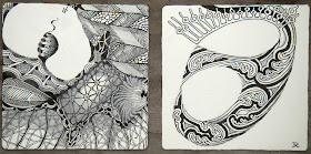
Life is a play of contrast and perspective and so is Zentangle. Ever notice how dark makes bright, brighter? - and bright makes dark, darker?
Enjoy how that interplay of contrast energizes these dynamic Zentangles.
No need to fear dark. You can handle it (with an occasional assist from a Sakura® Graphic 1).
Besides, Halloween is just around the corner. Give it a go!
Click images for larger view.


WOW!!These are great, dramatic designs.I love using black, and love bold designs, but can appreciate delicate work too.
ReplyDeleteThankyou for sharing.
Shading of Zentangles using pencils is new to me and looks very good. It gives a depth to the designs.
ReplyDeleteoooh... i love the tiles with the black background!
ReplyDeleteThe black background makes everything just POP. Thanks for sharing these designs. They are spectacular.
ReplyDeleteThey are wonderful!!
ReplyDeleteI'm trying to master shadows at the moment. I hope I'll be able to make contrasts soon. :)
These are wonderful. Another great challenge for the day!
ReplyDeletexo,
Heather
More, more, more. I just can't get enough.
ReplyDeleteThank you!
Marilyn
The Zentangles looks great with a black background. I would have never thought of that. I just purchased a couple of Sakura Graphic 1 and Brush Pens, too the other day.
ReplyDeleteI love dramatic high-contrast designs. These are beautiful!
ReplyDelete